Building a streamlined registration system for an online school’s group critique sessions, based on student concerns.
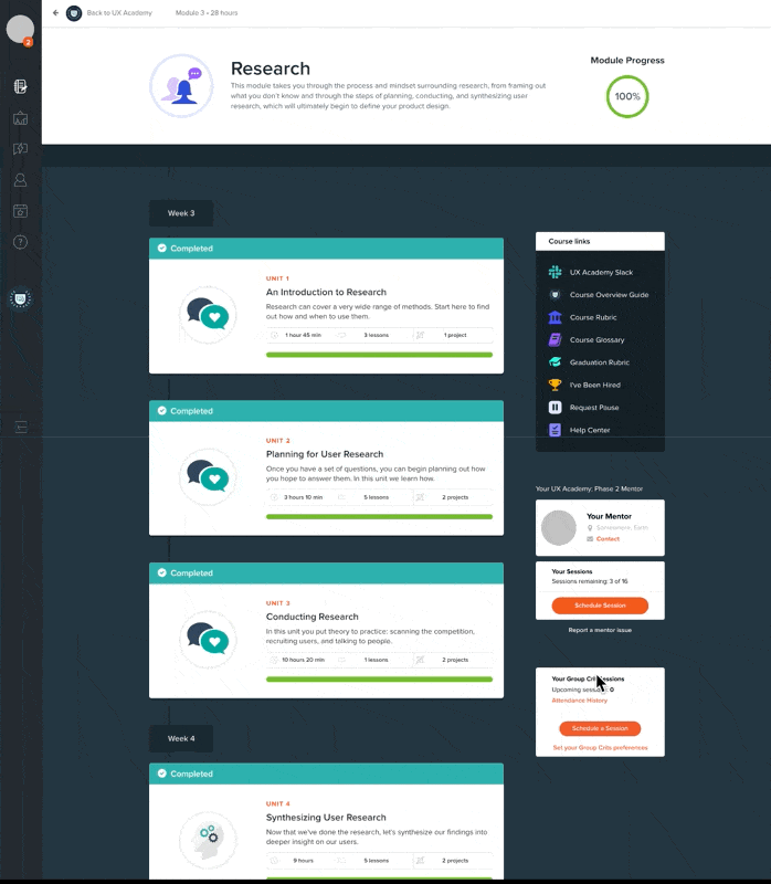
UX Academy is an online, self-paced, user experience design bootcamp from DesignLab. A major part of the program is a weekly group critique session (group crit) between small groups of students in the program. I learned students really dislike the current registration system for group crits. They say the current system is fragmented, and they want the process to be more streamlined and centralized in one location. Reusing UX Academy’s existing, internal, booking system for 1:1 student mentorship, I designed a more centralized and streamlined potential solution to the group crits registration process. Further, I added features to address student’s main booking concerns: considering student’s individual schedules, who’s facilitating the session, and bulk registering for sessions.
My Role
For this project, I am solo UX Researcher and UX Designer.
Process
Empathize
Students want a centralized, streamlined group crit registration process
Students dislike the group crit registration process. They all want the registration experience streamlined to 1-2 clicks and centralized in one place. I was also concerned how the registration system affects the Group Crit facilitators (it doesn’t). Interestingly, While UX Academy uses external 3rd party tools for group crits, they have an integrated booking system for students to arrange mentor lessons built into the platform.
Group Crits Registration Animation
This animation shows a process by which students can register for a group crit session at UX Academy.
Each step in the process is siloed – meaning they’re all independent of each other: Accessing the group crits portal; Login to AirTable for available sessions; The AirTable form for selecting student information; Selecting the session; Checking attendance; Canceling a booked session.
The system requires the user to actively remember information between tabs (dates, times, login details).
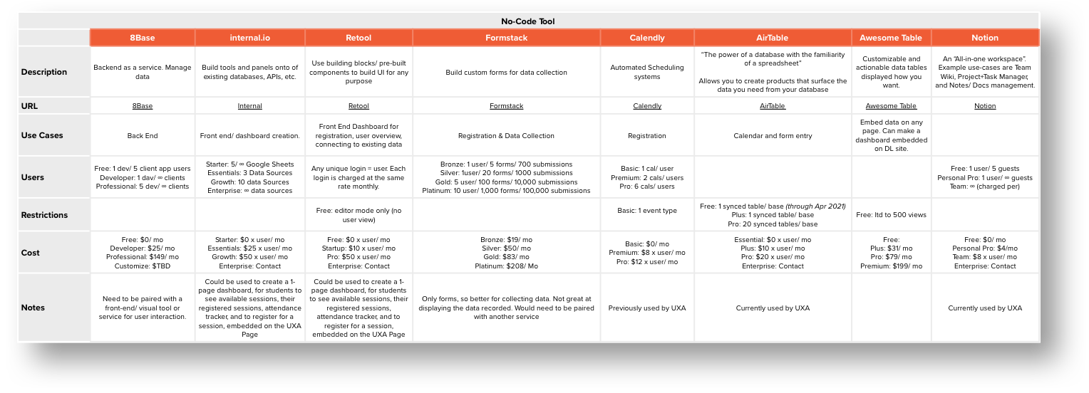
Product Comparison
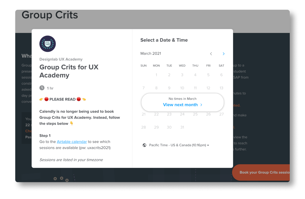
UX Academy currently uses AirTable as the registration system tool. Previously, Calendly was used for the system. I explored other no-code tool options to see what options exist.
Survey Outline
Because of time considerations and wanting scale of responses, I chose to survey rather than interview my participants. Being a UX Academy student, I had easy access to a pool of both students and group crit facilitators through our Slack workspace.
I wanted to understand what both students and facilitators need to exist for a great registration system experience; and how those requirements align or effect each other. For students, I also wanted to understand their group crit registration habits. To that end, I created two surveys, one for students, the other for facilitators.
Follow Up Survey
I asked follow up questions to the students surveyed and received responses from 80% of them. The follow up survey was to understand if a student’s enrolment (full-time or part-time) or preference for a particular facilitator has an affect their decision for group crit session registration.
Does your experience registering for group crits match your expectations of a registration process?
“The software interface for group crits is the shittiest UX experience ever!"
– Jared
Define
Despite each students’ circumstances being unique, they all have the same core tasks, constraints and similar habits related to group crits.
There are 4 main tasks student have related to group crits; the main one is registration. When registering for a session, student have two major considerations. First consideration is their schedules, second is who’s facilitating the session. Following that, most students also have similar habits for booking sessions. The other 3 tasks are canceling a session, viewing upcoming sessions and viewing attendance history.
Survey Report
Facilitators
My results from the facilitator were enough to inform me group crit facilitators are not effected by the student registration system. All facilitators need are
1/ an attendance list of expected students for the session
2/ the ability to track attendance. Both of these are out of scope for this project.
Students
Students also stated they have two major considerations.
1/ There are too many steps required in accessing the group crit system
2/ They want all information centralized in one location
A third consideration (uncovered through my findings from the follow up survey) is, although students consider who the group crit facilitator is as deciding factor, they typically choose their group crit session dependent on their schedule regardless of their enrolment type. Therefore, my solution should consider student’s schedules as a variable.
"Having to click so many times […] could be easily fixed to just ONE click"
– Krista
When do you try to schedule your group crit sessions for?
How often do you register for group crit sessions?
Do you choose your group crit session based on facilitator?
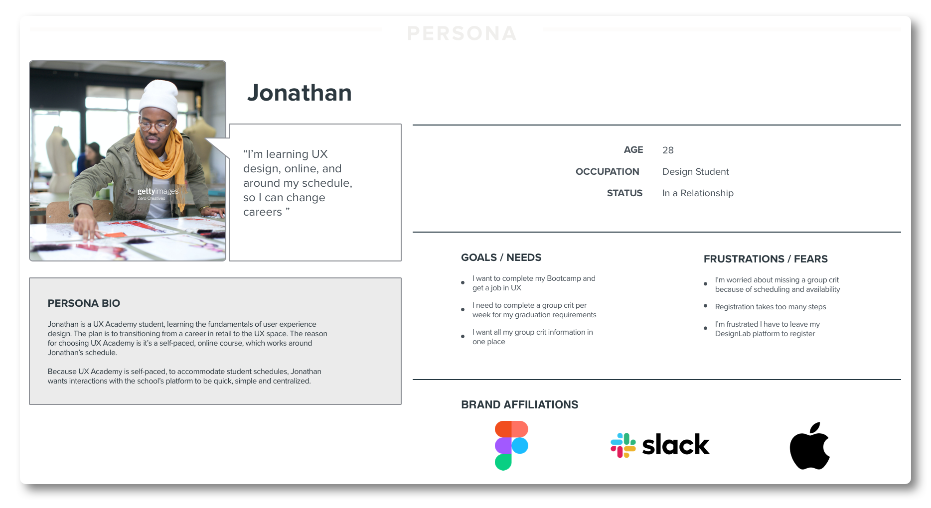
Persona
Despite all the students being unique, their needs for group crit registration were all very similar.Because of this, I found creating only single persona was necessary.
"I think it’s odd to have the attendance tracker, scheduling, canceling, group crit info all in separate pages"
– Samuel
Task Flow and Product Requirements Report
There are 4 tasks a student has with regards to group crits:
1/ Register for a session
2/ Cancel a session
3/ View attendance history
4/ View upcoming sessions
I assumed “view upcoming sessions” solves itself, since users need to access their sessions to be able to cancel a specific one.
Instead, I focused on what necessary steps and requirements need to exist for tasks 1-3. In doing so, I discovered there’s a lot of overlap, which works well with centralizing all of the tasks into one place.
How might we create a process for UX Academy’s group crit registration which focuses on conveniently centralizing relevant information and caters to each individual student’s schedule?
Ideate
Integrate group crits registration in to the UX Academy student dashboard.
Because students wanted group crits centralized, I decided to integrate registration into the UX Academy student dashboard (instead of using external tools). I also added 2 new features. Because students main concerns are their schedule and who’s the facilitator, I added a feature to allow students to filter available sessions by preferences. Second, because of their registration habits, I added a feature to allow registering for multiple sessions at once. These features are intended to streamline the registration process down to a handful of clicks.
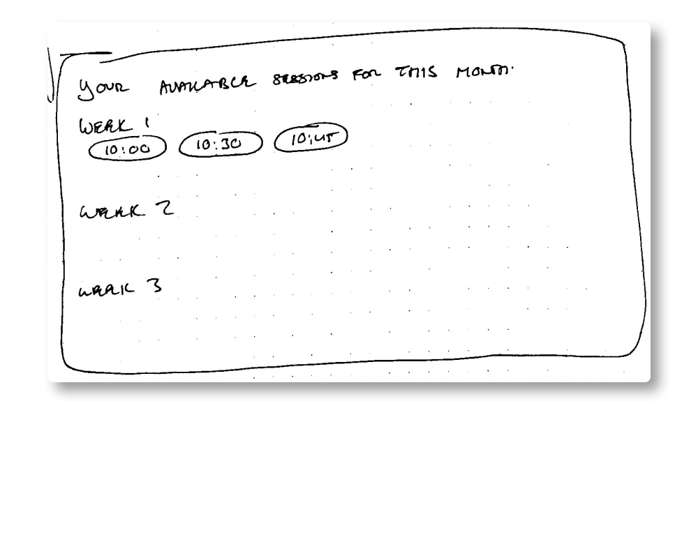
Sketches
These sketches are early ideas of student registration flows. They incorporate student schedule preference and the ability to register for multiple sessions (a need shown by the pie charts previously).
Source Screenshots
Rather than use external, 3rd party tools, I decided to centralize the feature as 1st party in the student dashboard. I took screenshots of the existing design style and components to maintain consistency + design inspiration.
Main Widget
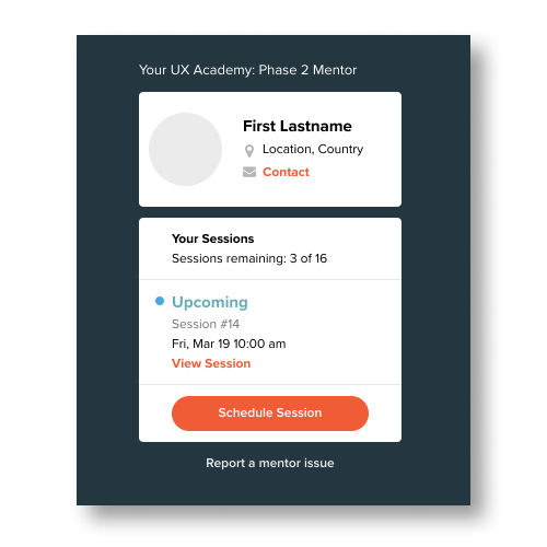
The existing mentor widget is an ideal group crits hub template. I repurposed the design,incorporating all of the necessary feature for the 4 major tasks all in one area.
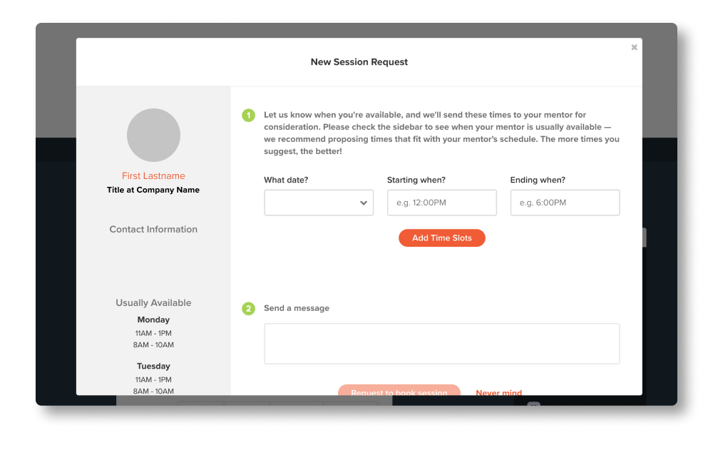
During initial UXA course registration, students are asked their availably for 1:1 mentoring. This availability could also be applied to group crits and the “schedule a session” interaction.
Design & Prototype
Repurposing UX Academy’s existing UI
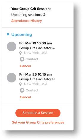
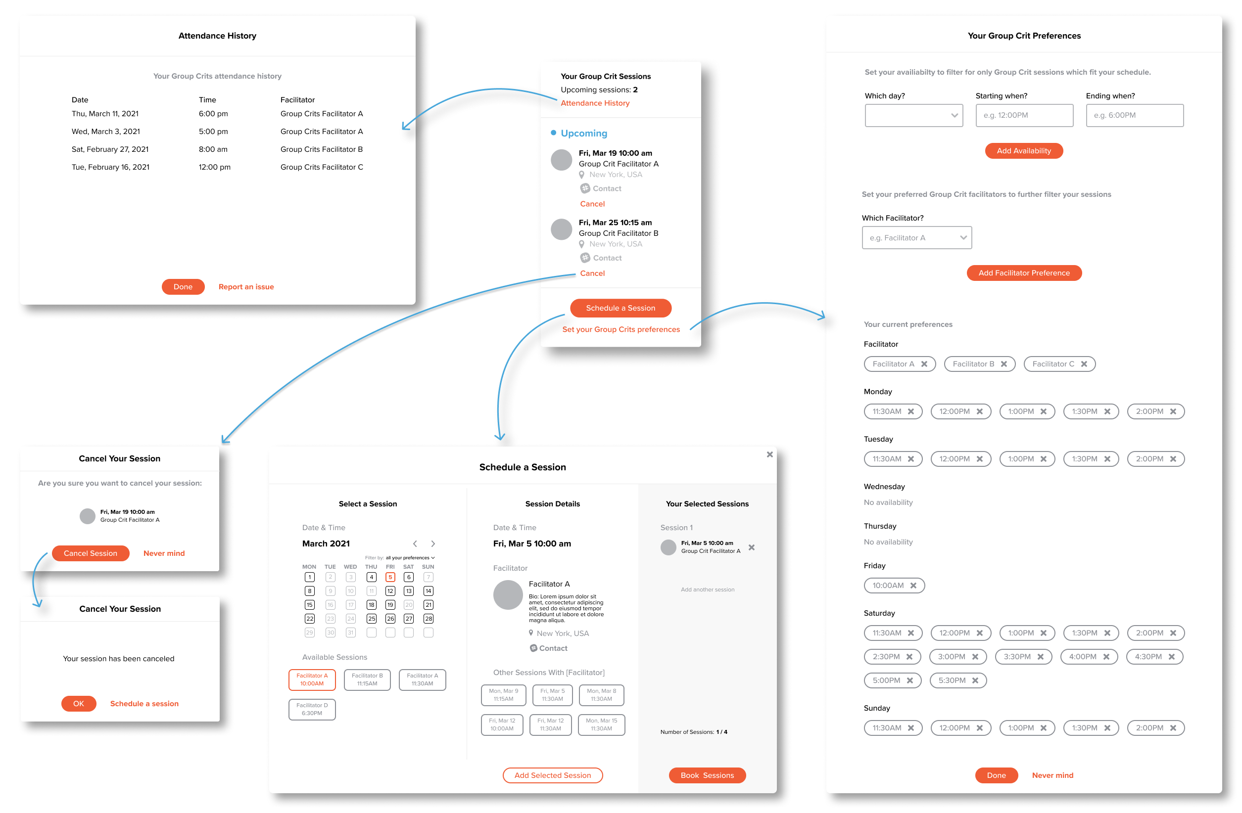
I reused as many components from the existing booking design as possible. For example, the group crits card is a repurposed version of the mentor sessions card. Copying that pattern centralizes all the interactions into one compact space and increases discoverability. In the few times UXA didn’t have an existing design element to use, I looked for other, existing, design patterns. For booking multiple sessions I used a shopping cart/ check-out like pattern. I added a filter toggle so users can adjust how their preferences are applied to displayed sessions.
Main Widget (Updated)
The main widget remained pretty much the same. Added, at the bottom though, is the ability to set or update user preferences.
Setting Availability
Added ability to set preferences directly from the widget for better user control, over the course of study. The design is heavily inspired from the existing interaction for booking 1:1 mentorship dates between student and mentor.
Includes facilitator preference as a variable in addition to Schedule
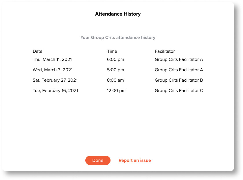
Attendance History
At a glance view of all the sessions a student has attended.
Step 1
Step 2
Cancel a Session
Quick interaction, with a confirmation prompt incase of un-intentional click.
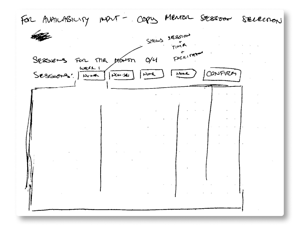
Version 1 - Weekly View
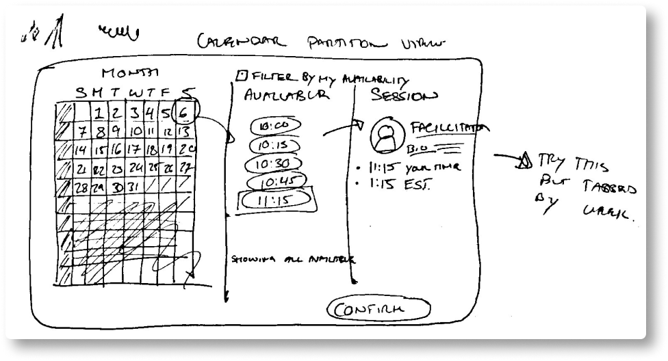
Version 2 - Month View (Final Version)
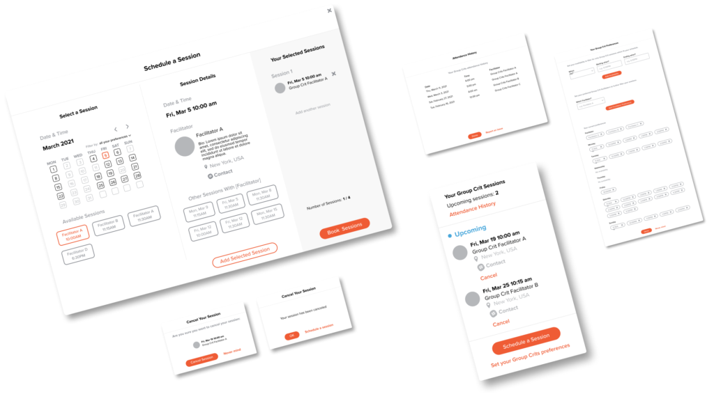
Schedule a Session
UX Academy only allows students to book 1 session per week and only during the current month.
The system in Version 1, is based around displaying sessions available 1 week at a time during that month. When a session is selected, the tabbed view displays a session overview with facilitator details (maybe a new facilitator, student is unfamiliar with).
The week view for the calendar, though, was very unpopular with surveyed students. They expected to see a monthly calendar (updated in version 2).
I also added the furthest right tab as a “shopping cart” like design pattern. This “selected sessions tab” allow students the flexibility to book as many or as few sessions at one time (without leaving the window). Buttons were also adjusted to help guide the user through the flow.
Test
Students like the system and have feedback for clearer UI.
The prototype tested well and students were happy with the solution. Three areas of improvement were identified. First, students want a more detailed attendance history which clearly informs if they have received credit for attending a session or not. Second, students also found the way other sessions of the same facilitator is displayed confusing. Lastly, students didn’t notice the preferences filter in the UI (too small).
Group Crits Architecture
Prototype Usability Test
Usability testing was looking for 3 things.
1/ Can students complete the 4 main group crits tasks
2/ Do they understand the new added preferences filter feature
3/ How do students feel about the implementation and visual appeal?
I conducted moderated user tests, over zoom, using Figma’s built-in prototyping tools.
1/ The filter feature (allowing students to adjust their preferences while registering) is too small in the “Schedule a Session” window.
2/ Students were slightly confuse by the positioning of “Add Selected Session” button and the “Other Sessions With Facilitator” options. They were unsure which session they were adding, or how they might interact with the other session options listed.
3/ Students were concerned with clearly understanding which sessions they had received credit for. They suggested using a visual indicator.
"I don’t know why they couldn’t figure this out for themselves?"
– Hayley
Conclusion
Students have surprising mental models
There were a few interesting insights I observed from this project around students’s mental models. First, students are very concerned with checking off graduation completion requirements, rather than the quality or content of the discussion. They wanted trackers for how many sessions needed to attend and wether they got credit for attending. Second, I thought a calendar displayed in a weekly view would reduce complexity, but students expected and asked the calendars be displayed in monthly view instead. Everyone who participated though, wondered why this version of the registration system didn’t already exist.